One of the most important things you will design is your business brochure. Often a decision on whether or not to use your products or services is made based on this one important piece of marketing material.
The layout, presentation, and message of your business brochure can make or break your campaign. Therefore, it is important to take many aspects of the brochure design process into consideration.
The Importance of Layout and Design
Your layout and design are as important as your message. The organization of your layout will let your potential customers know how professional and organized you may be. It should flow and make sense to the reader.
Design is also important and should not be taken lightly. You will want to make sure that your design is visually pleasing and draws attention to those parts of the corporate brochure that matter the most.
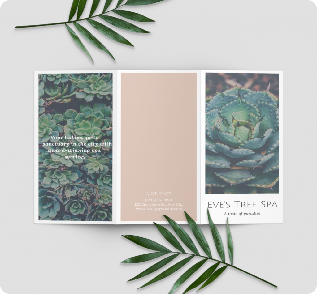
A good tip is to think about how your business brochure will be folded. A standard tri-fold brochure or pamphlet, for example, should have the most important text and images on the panel to the right for the outside of the brochure. Here is an example:

Creating a Strong Branded Message
Your message is the most important part of your business brochure. It is what will convince your prospect to use your products or services. The message you convey in this document should be based on the goals and mission of your business.
It should meet or exceed all of the expectations of your potential client. In short, you need to have a branded message that gets your point across quickly while still creating a brand image and maintaining a strong reputation.
A branded message is one that creates an image of your product or service brand. It should relay the features and benefits of your product or service while also conveying what sets you apart from your competitors. It should be unique, straightforward, and concise.
You should also avoid using a lot of technical language in your brochures unless it is imperative to your message and necessary to convey the features and benefits of your product. This is because technical language often confuses most consumers, and it will not do anything to sell your product or service.
Choosing Fonts, Colours, and Images
To have your business brochure stand out from your competition, the unique use of fonts, colours, and images is a great start. Vibrant colours, bold text, good use of white space all can play an important part in your design. However, there is such a thing as too much of a good thing.
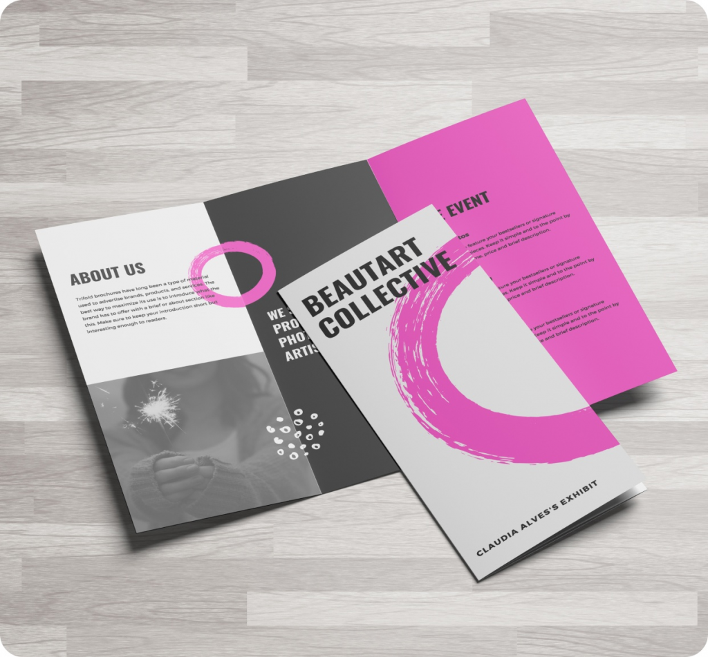
You do not want to overdo it with too many colours and fonts. Come up with a colour scheme for your brochure and choose a readable font with a good range of styles and weights such as Palatino, Frutiger, Minion or Garamond. While you want your brochure to stand out and be inviting, you also want it to be readable without being hard on the eyes. Here is a good example:

In addition, you want to be careful about which images you choose to include in your brochure. Images should be attention-grabbing while also being relevant to your subject matter. It will profit you nothing if you grab someone’s attention with graphics and images only for them to discover that your products and services have nothing to do with the subject of your images.
You will also want to choose images that are clear and professional in appearance. Stock photos are one source for images, but if you have the budget, hiring a photographer or taking your own photos works best and can make your brochure even more unique.
Brochure Printing
Once you’ve finished designing your effective business brochure, you’ll need a print shop that provides high-quality printing services. Remember, a good printing company helps your design look its best by offering a number of options such as size, paper stock, types of folding, and more.
If designing an effective business brochure still sounds difficult, don’t worry. Eprintfast provides free customizable templates that you can use to create your corporate brochures and other marketing materials. Our fast, affordable brochure printing services will get your brochures printed and shipped to you in no time.

Brochure creativity starts with a good layout and selection of fonts. I think this good information for newcomers designer.
Agreed! Thanks, Alok.
Way cool! Some very valid points! I appreciate you penning
this post plus the rest of the website is also very
good.
Like!! Really appreciate you sharing this blog post.Really thank you! Keep writing.
Great post.